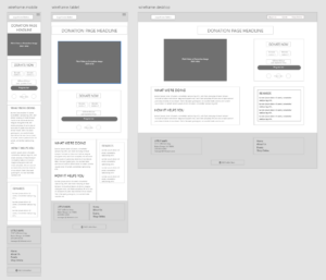
Once upon the time, the internet was for computers, and there were only a handful of screen sizes we had to worry about. Then the cell phone came along, and the public started walking around with small computers in their pockets. For a few years, people accepted websites that just didn’t work well on tiny, flip-phone screens. They focused on text and zoomed in when they had to, and then we all went through a weird transitional period where businesses used separate mobile and desktop websites, with webpages on phones often containing a fraction of what the full computer-based site would.
Those days are over. Today, people are always on the go, and your audience is most likely coming to your site from something other than a full computer. As of October, 2023, over 55% of all internet traffic comes from mobile devices! But there are still a lot of users on traditional monitors, as well, and it’s not unusual for the same person to browse the same site on three or more different screen sizes. That’s where mobile first design comes in.
What Is Mobile First Design?

Back when we only had full computers to worry about, websites were static, which meant nothing changed size no matter what screen was used, and when people started viewing them on mobile phones, they had to scroll left and right to see all the content. Separate mobile sites became the stop gap to deal with this problem.
The fact is, you’re going to get a lot of web traffic from users on small screens, and it’s easier to size up than it is to size down. With mobile first design, you start with a layout for the smallest screen width, often placing your content in a single column. Then as the screen size gets wider, you build it out to have more and more content side by side.
By designing with the mobile user in mind, you ensure all the important information is there for everyone. But that doesn’t mean you can’t take advantage of all the real estate that comes with full computers (or in some cases, ultra widescreen TVs!).
Making the Most of Every Size
Mobile first design isn’t about limiting yourself. It’s about making sure you aren’t limiting your users just because they’re using the device they have on hand. You might remember the in-between days of looking at a site on a phone and then having to hit “Go to desktop site” in the upper righthand corner and zoom way in to find the information you needed. By starting on the small end, you know you have everything you need, you might have some cool tricks just for mobile, and as you move up in size, you can add those nice touches that make full desktop sites so fun.
Our sites use mobile first responsive design, which means they fluidly adapt from tiny phone screen sizes all the way up to widescreen displays. If you want to see this happening in real time, you adjust the size of your browser window on your computer. Hit that window restore button (the one that kind of looks like this ) on the upper right-hand side to exit full screen mode, move your mouse off to the side until you get the horizonal arrows, click and hold, and you can make your window fatter and thinner and see how this page changes!

